library(targets)
library(ggplot2)
library(tidyverse)
library(tidybayes)
The Ricker model is a discrete model of population growth. Let’s get to know this model with a few extensions, and fit a demo of it in Stan.
Simulating the Ricker model
The model in its simplest form looks like this:
\[ N_{t+1} = N_te^{r\left(1 - \frac{N_t}{K}\right)} \] You can see that there is density dependence: when \(N_t << K\), the population grows by a factor of \(e^r\) every time step. When \(N_t = K\), the population hits carrying capacity and the population grows by a factor of 1 : e.g. no change.
To start to draw this function I’ll assign values to the parameters and simulate a curve:
r <- 0.05
c <- 4
N0 <- 5
K <- 500

time <- 300

N <- numeric(time)

N[1] <- N0

for (t in 2:time){
  ri <- rnorm(1, mean = 0, sd = 1)
  # print(ri)
  N[t] <- N[t-1]*exp(r * (1 - N[t-1]/K))
}

plot(N, type = "l")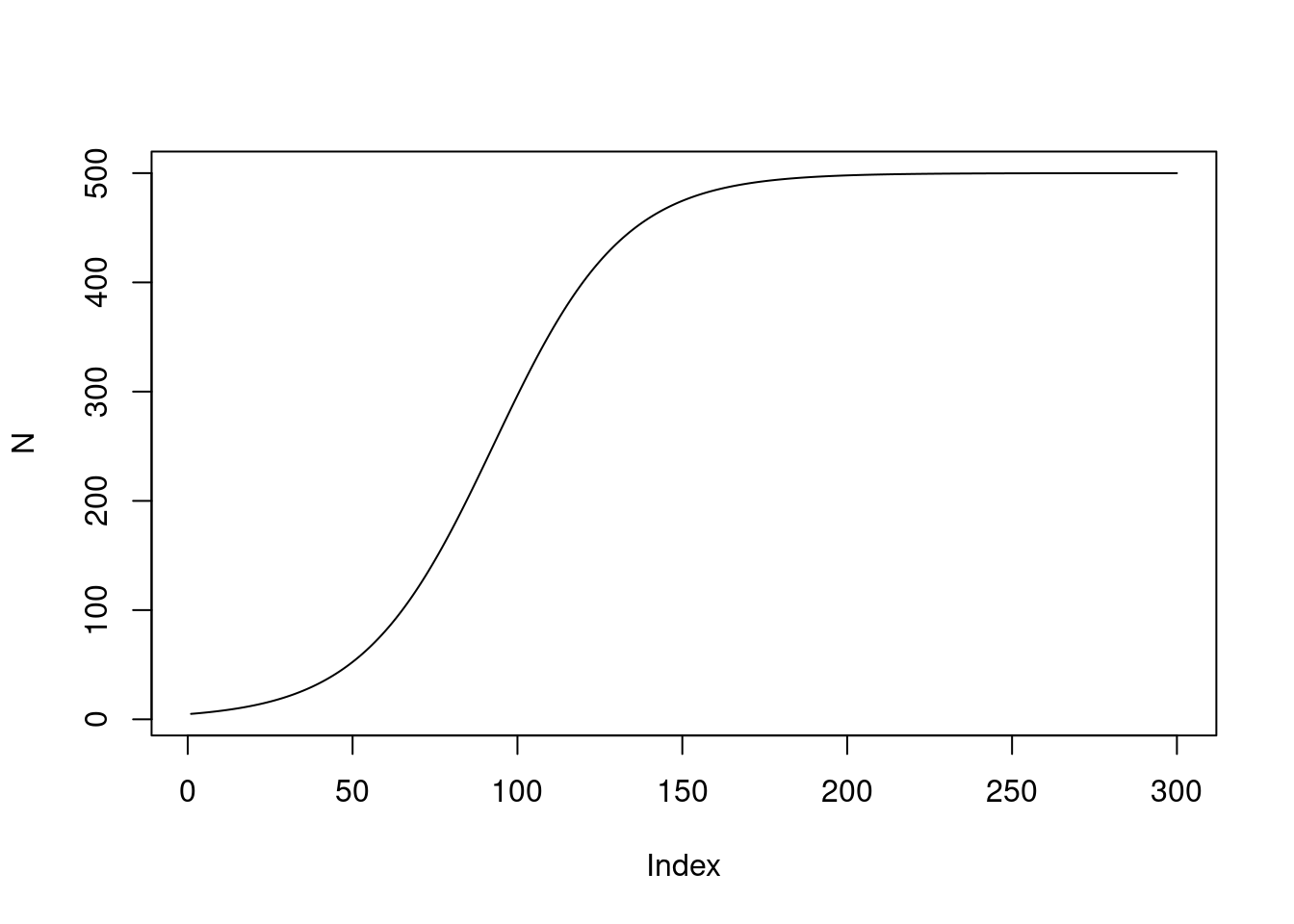
Extending it: uncertainty and Allee effects
Now let’s add some uncertainty every time step! This is a kind of process error: growth rates bounce around randomly from one year to the next, perhaps because of unmodelled processes that affect the average growth rate in the population:
\[ \begin{align} N_{t+1} &= N_te^{r_t\left(1 - \frac{N_t}{K}\right)} \\ \log(r_t) &\sim \text{Normal}(\mu,\sigma) \end{align} \] Here I’m using a log link on \(r_t\) because I want to be able to give \(r_t\) a mean and a variance without worrying about the growth rate flipping sign and suddenly becoming negative.
The second modification I want to make is to add Allee effects to the model. This is another kind of density dependence, but at the other extreme of density: instead of the population getting so large that it grows ever more slowly, it is also possible for the density to be so small that it grows slowly. Its the same kind of thing, and we add it in the same kind of way:
\[ \begin{align} N_{t+1} &= N_te^{r_t\left(1 - \frac{N_t}{K}\right)\left(1 - \frac{C}{N_t}\right)} \\ \log(r_t) &\sim \text{Normal}(\mu,\sigma) \end{align} \]
Now we’re ready to simulate it all again, and this time I want to wrap it in a function for easy repetition later:
sim_ricker_allee <- function(
    r = 0.05,
    C = 9,#44
    N0 = 7,
    K = 500,
    time = 300,
    sd_process = 1.2){

  N <- numeric(time)

  N[1] <- N0

  for (t in 2:time){
    ri <- rnorm(1, mean = 0, sd = sd_process)
    # print(ri)
    N[t] <- N[t-1]*exp(exp(log(r) + ri) * (1 - N[t-1]/K) * (1 - C/N[t-1]))
  }

  return(N)
}
We can repeat it many times using a sprinkle of syntatic sugar thanks to the purrr package1:
allee_sim <- map_df(1:50, ~ tibble(
  N = sim_ricker_allee(
    time = 300,C = 6, N0 = 7),
  time = 1:300,
  7),
  .id = "sim") |>
  bind_cols(type = "allee")


no_allee_sim <- map_df(1:50, ~ tibble(
  N = sim_ricker_allee(
    time = 300,
    C = 0,
    N0 = 7),
  time = 1:300,
  7),
  .id = "sim") |>
  bind_cols(type = "no allee")


two_sims <- bind_rows(allee_sim, no_allee_sim)

two_sims |>
  ggplot(aes(x = time, y = N, group = sim)) +
  geom_line() +
  coord_cartesian(ylim = c(0, 1000)) +
  facet_wrap(~type)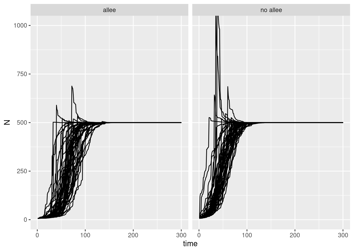
two_sims |>
  ggplot(aes(x = time, y = N, group = sim)) +
  geom_line() +
  facet_wrap(~type) +
  coord_cartesian(xlim = c(0, 50), ylim = c(0, 100))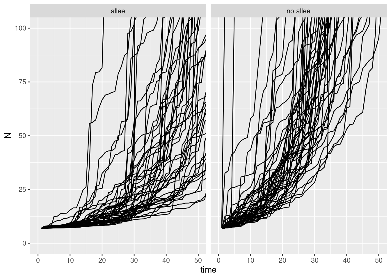
and if we look at these another way we can see the difference:
deltaN_data <- two_sims |>
  filter(type == "no allee") |>
  group_by(sim) |>
  mutate(deltaN = log(N/lag(N))) |>
  drop_na(deltaN)

deltaN_data |>
  ggplot(aes(x = N, y = deltaN)) +
  geom_point() +
  coord_cartesian(ylim = c(-10, 5), xlim = c(0, 600))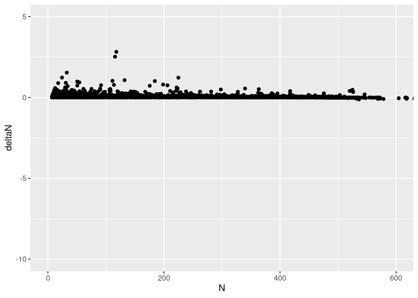
deltaN_data |>
  ggplot(aes(x = N, y = deltaN)) +
  geom_point() +
  coord_cartesian(ylim = c(-.0,1), xlim = c(0, 600))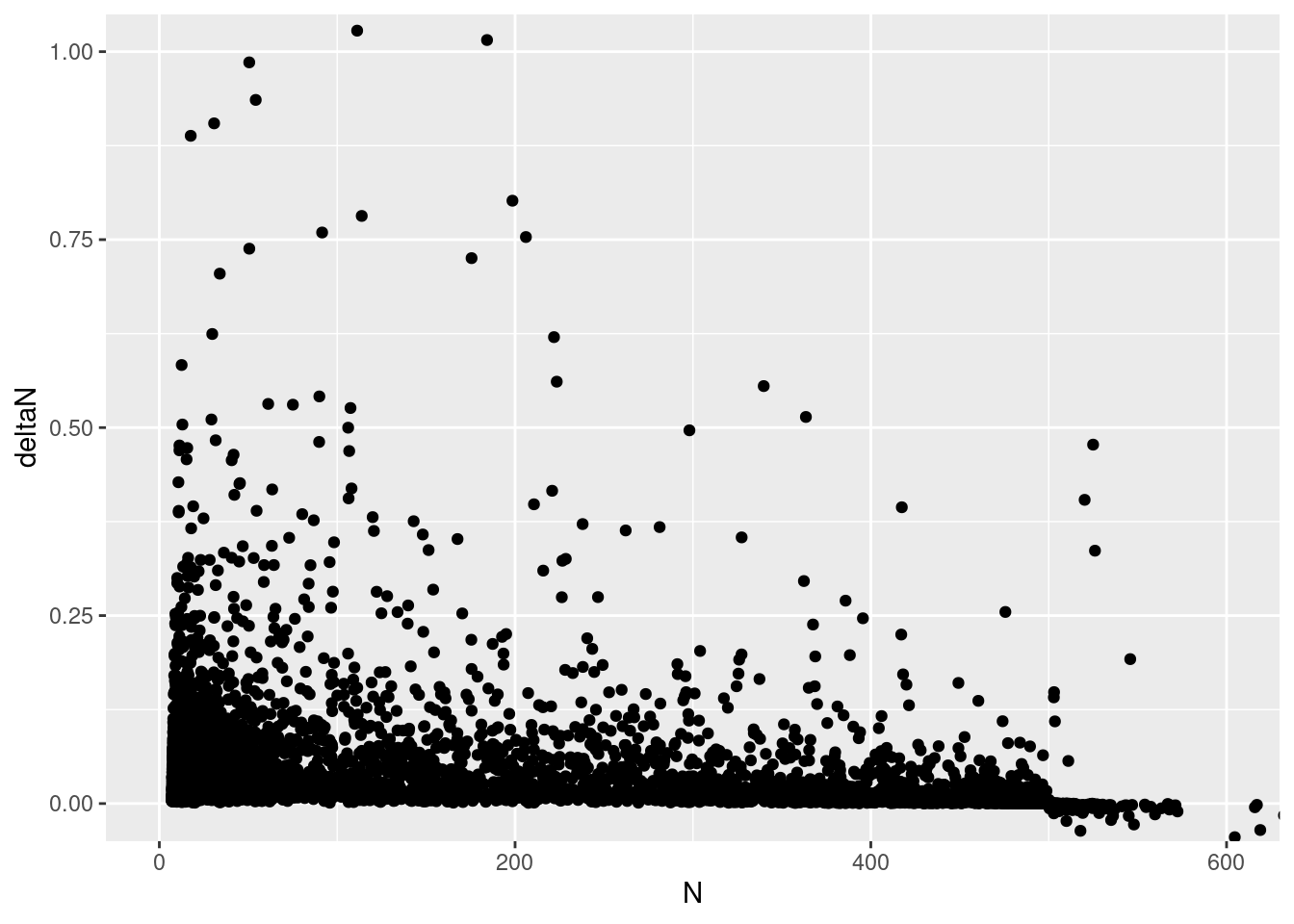
This really doesn’t seem right! The y intercept is supposed to be \(r\), and the X intercept is supposed to be \(K\)! Is the cause the variation in growth rate? that is, the parameter sd_process above?
Let’s make a new simulation where this is set to a very low value: :swea
map_df(1:50, ~ tibble(
  N = sim_ricker_allee(
    time = 300,
    C = 0,
    N0 = 7,
    sd_process = 0.01),
  time = 1:300,
  7),
  .id = "sim") |>
  group_by(sim) |>
  mutate(deltaN = log(N/lag(N))) |>
  drop_na(deltaN) |>
  ggplot(aes(x = N, y = deltaN)) +
  geom_point() +
  coord_cartesian(ylim = c(0, .1), xlim = c(0, 600)) +
  geom_hline(yintercept = .05) +
  geom_vline(xintercept = 500)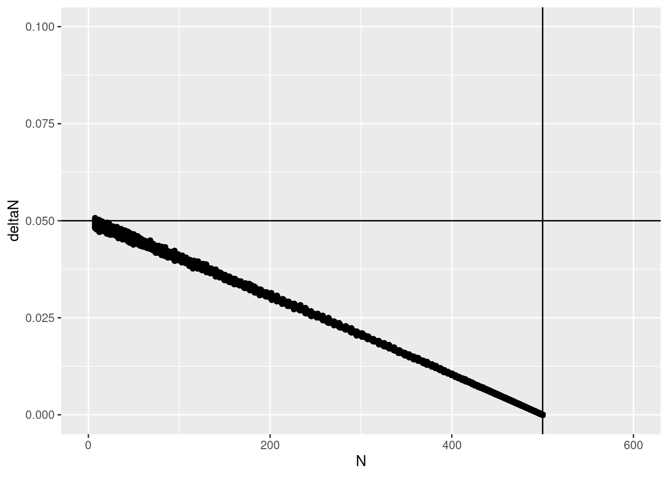
Much better! so the process error makes this pretty traditional plot go kind of haywire.
Interestingly, looking back at the previous figures, you can see that the error is not around the “correct” line at all but mostly below it. That suggests that trying to model error based on lagged growth is probably not going to give a useful answer for the parameters
Observation error
So far all of this has been in a perfect, imaginary world where we have perfect information on the population density. In reality, we’ll always have a sample of the population density. A simple model for this variation is that it follows a Poisson distribution:
\[ \begin{align} Y_t &\sim \text{Poisson}(N_t)\\ N_{t+1} &= N_t e^{r\left(1 - \frac{N_t}{K}\right)} \\ \end{align} \]
Lets do a simulation of several observations of one single time series:
set.seed(1618)
avg_dens <- sim_ricker_allee(C = 5, N0 = 7, time = 120)

obs_dens <- avg_dens |>
  imap(
    ~tibble(
      time_id = as.numeric(.y),
      obs = rpois(5, lambda = .x),
      obs_id = seq_along(obs)
    )

  ) |>
  bind_rows()


obs_dens |>
  ggplot(aes(x = time_id, y = obs,group = obs_id)) +
  geom_line() +
  geom_line(aes(x = time_id, y = avg), inherit.aes = FALSE,
            col = "red",
            data = tibble(
              time_id = seq_along(avg_dens),
              avg = avg_dens))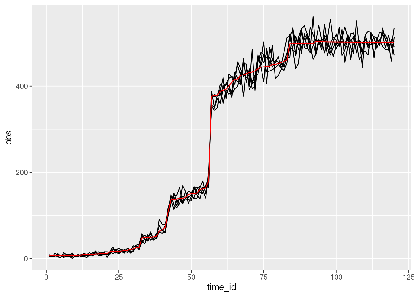
This shows a few things of interest: the wiggling red line, which shows variation in growth rate at each timestep. This is process error. We can also see variation around this; these is variation coming from a Poisson distribution centered on the true mean population size.
Coding and validating a model
We’re going to torture the math a little bit, to make it more convenient to write it Stan:
Take the expression for the average and log both sides:
\[ \begin{align} N_{t+1} &= N_te^{r\left(1 - \frac{N_t}{K}\right)} \\ \ln(N_{t+1}) &= \ln{N_t} + r(1 - \frac{N_t}{K}) \\ L_{t+1} &= L_t + e^{\ln{r} + \ln(1 - e^{L_t - \ln{K}})} \\ L_{t+1} &= L_t + e^{s + \ln(1 - e^{L_t - J})} \\ \end{align} \] Here to keep notation simple I’m just writing
- \(s = \ln{r}\)
- \(J = \ln{K}\)
- \(Lt = \ln{N_t}\)
I know what you’re thinking: get help, Andrew!
There’s a couple reasons for this violence:
- Working on the log scale is easier for parameter estimation. it keeps values on similar scales, even though, for example \(r\) and \(K\) have very different magnitudes.
- We can take advantage of Stan’s built-in composed functions
- it will be easier to add hierarchical effects if (when :P ) we want to do that!
Here’s a more complete rendering of the model, which will set us up for writing Stan code in the next section:
\[ \begin{align} Y_i &\sim \text{Poisson\_log}(L_{t[i]}) \\ L_{t+1} &= L_t + e^{\left(s + \ln\left(1 - e^{L_t - J}\right)\right)} \\ L_0 &\sim \text{Normal}(2,1) \\ s &\sim \text{Normal}(-3, 0.5) \\ J &\sim \text{Normal}(6, 1) \end{align} \]
Footnotes
I’m old enough to remember when we did everything with for loops and the *apply family and I just hope the youth are grateful for the advances they have now!↩︎