some_numbers <- rnorm(1560, mean = 14, sd = 2.5)
hist(some_numbers)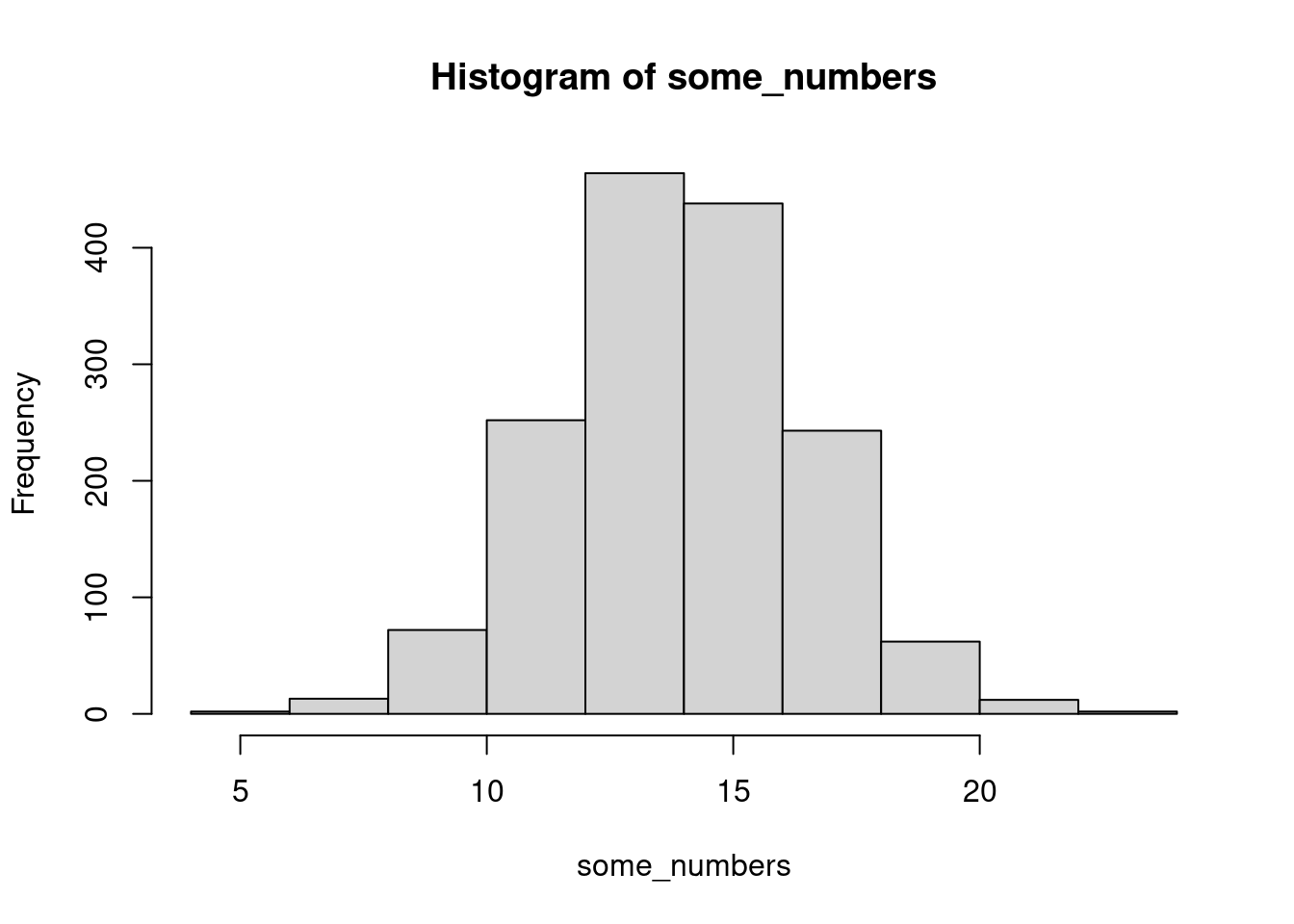
This is not a review or a proof of the Probability Integral Transform. A grad student asked me “what is this and why does it work” and I wanted to explore it with them.
Among the many wonderful plots that you can make with bayesplot, you will find one called ppc_loo_pit_overlay. You can read a lot more about it in this fabulous paper on Visualisation in Bayesian Workflow (Gabry et al. 2019)
So what is it, and how does it work?
Take random numbers from a distribution
some_numbers <- rnorm(1560, mean = 14, sd = 2.5)
hist(some_numbers)
Then run them through that distribution’s CDF
some_pit <- pnorm(some_numbers, mean = 14, sd = 2.5)
hist(some_pit)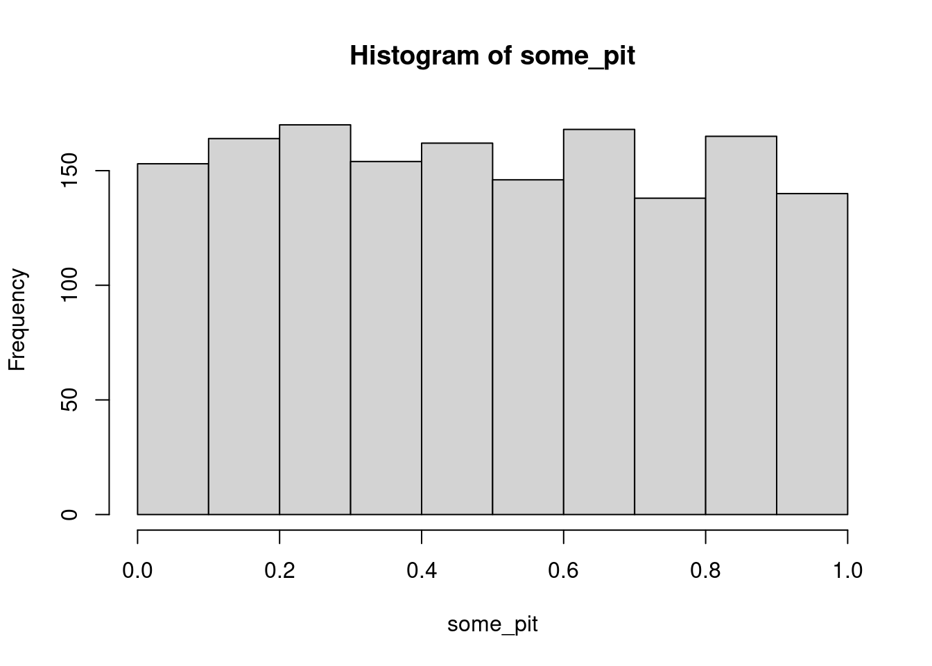
Sure enough we get a uniform shape!
let’s make some curves that don’t really match
library(tidyverse)
n <- 4000
tibble(meanval = seq(from = 1, to = 14, length.out = 6),
       sd = 2.5) |>
  expand_grid(x = seq(from = 0, to = 18, length.out = 30)) |>
  mutate(normal_dist = dnorm(x, mean = meanval, sd = sd),
         gamma_dist = dgamma(x,
                        shape = meanval^2/sd^2,
                        rate = meanval/sd^2)) |>
  pivot_longer(ends_with("dist"),
               names_to = "distribution",
               values_to = "value") |>
  ggplot(aes(x = x, y = value, colour = distribution)) +
  geom_line()  +
  facet_wrap(~meanval)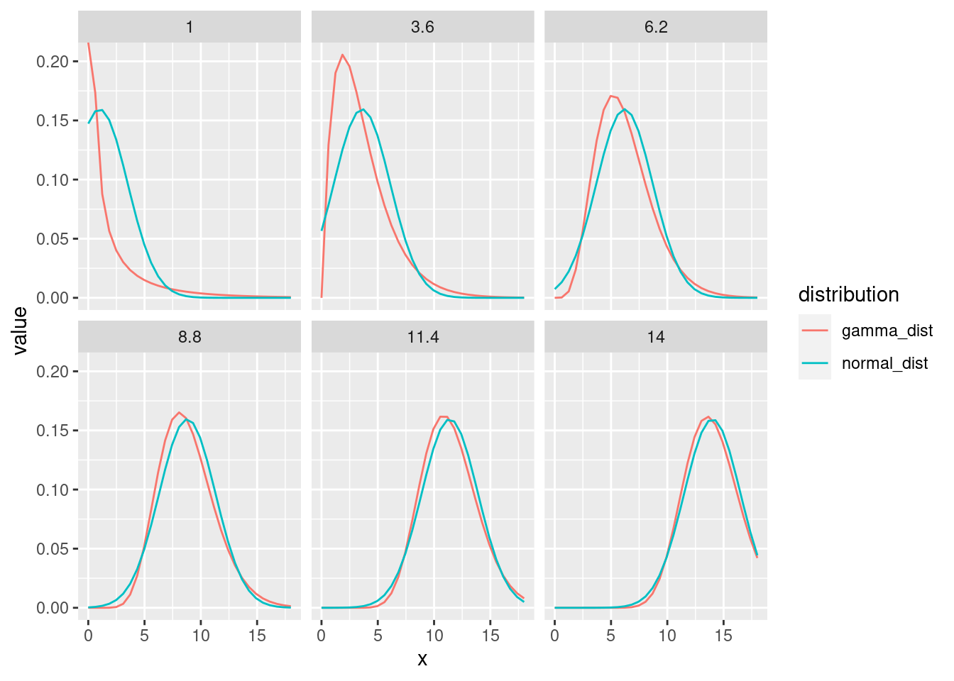
We can see that the fit gets worse as the mean drops
let’s simulate data from the gamma and use the PIT assuming instead it is normal:
n <- 4000
tibble(meanval = seq(from = 1, to = 14, length.out = 6),
       sd = 2.5) |>
  rowwise() |>
  mutate(normal_dist = list(rnorm(n, mean = meanval, sd = sd)),
         gamma_dist = list(rgamma(n,
                        shape = meanval^2/sd^2,
                        rate = meanval/sd^2))) |>
  pivot_longer(ends_with("dist"),
               names_to = "distribution",
               values_to = "samples") |>
  rowwise() |>
  mutate(pit_samples = list(pnorm(samples, mean = meanval, sd = sd))) |>
  select(-samples) |>
  # filter(distribution == "gamma_dist") |>
  unnest(pit_samples) |>
  ggplot(aes(x = pit_samples)) +
  geom_histogram() +
  facet_grid(distribution~meanval)
`stat_bin()` using `bins = 30`. Pick better value with `binwidth`.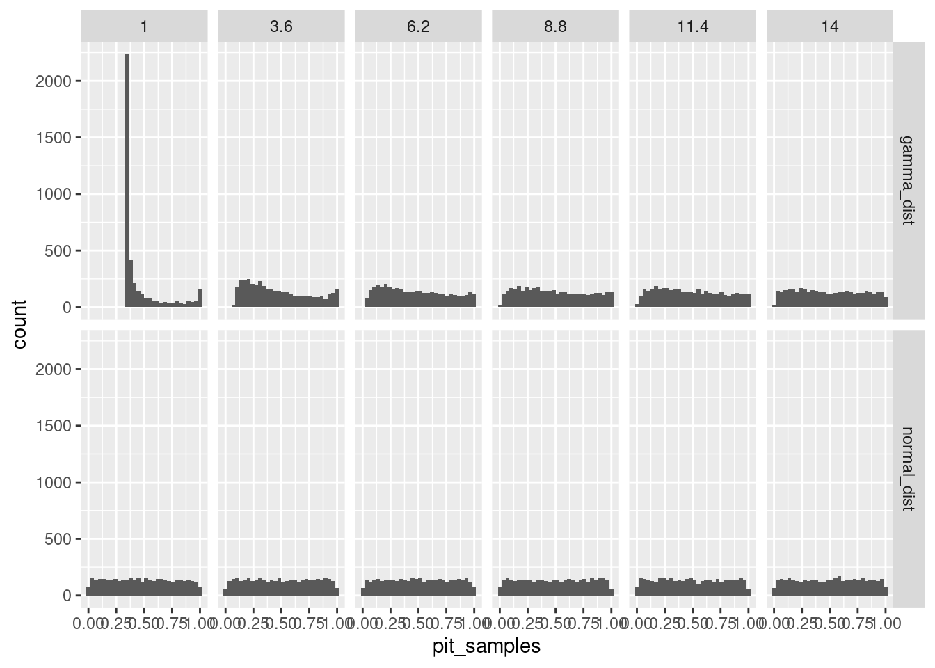
let’s try it with just the gamma, but changing both moments and always using the normal:
n <- 4000
expand_grid(meanval = seq(from = 1, to = 14, length.out = 6),
       sdval = seq(from = .2, to = 7, length.out = 4)) |>
  rowwise() |>
  mutate(gamma_dist = list(rgamma(n,
                        shape = meanval^2/sdval^2,
                        rate = meanval/sdval^2))) |>
  rowwise() |>
  mutate(pit_samples = list(
    pnorm(gamma_dist,
          mean = meanval,
          sd = sdval))) |>
  select(-gamma_dist) |>
  # filter(distribution == "gamma_dist") |>
  unnest(pit_samples) |>
  ggplot(aes(x = pit_samples)) +
  geom_histogram() +
  facet_grid(sdval~meanval)
`stat_bin()` using `bins = 30`. Pick better value with `binwidth`.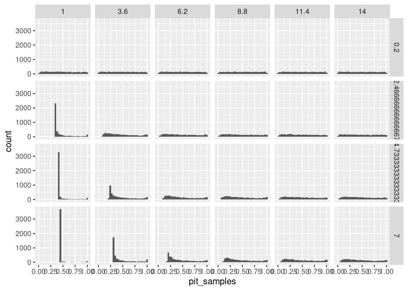
and with the lognormal
n <- 4000
expand_grid(meanval = seq(from = 1,
                          to = 14,
                          length.out = 6),
       sdval = seq(from = .2,
                   to = 7,
                   length.out = 4)) |>
  rowwise() |>
  mutate(
    cf = log(sdval/meanval)^2 + 1,
    lnorm_dist = list(rlnorm(n,
                        meanlog = log(meanval) - .5*cf,
                        sdlog = sqrt(cf))
                      )
    )|>
  rowwise() |>
  mutate(pit_samples = list(
    pnorm(lnorm_dist,
          mean = meanval,
          sd = sdval)
    # plnorm(lnorm_dist,
    #        meanlog = log(meanval) - .5*cf,
    #        sdlog = sqrt(cf))
    )) |>
  select(-lnorm_dist) |>
  # filter(distribution == "gamma_dist") |>
  unnest(pit_samples) |>
  ggplot(aes(x = pit_samples)) +
  geom_histogram() +
  facet_grid(sdval~meanval)
`stat_bin()` using `bins = 30`. Pick better value with `binwidth`.
The PIT is one of an arsenal of diagnostic tools. The idea here is to run data “backwards” through the distribution we’ve chosen. If the distribution we chose is something like realize, the result should look kind of flat. If we are very far wrong, it won’t be flat. So this can serve as a quick goodness-of-fit test for your response distribution